Pseudo selector
Before and After pseudo selector

Before pseudo selector:-
In CSS, ::before creates a pseudo-element that is the first child of the selected element. It is often used to add cosmetic content to an element with the content property. It is inline by default.
We should always write with double semicolon ::before and ::after, other pseudo element in :hover, :visited etc.
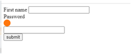
Here we are going to use “pseudo before” on the class “.red”, present at First name.
 <Style>
        .red::before {
            content: '';
            display: block;
            width: 20px;
            height: 20px;
            border-radius: 10px;
            background-color: rgb(255, 115, 0);
        }
    </Style>
    <form action="#" method="get">
        <label class="red" for="first name">First name</label>
        <input type="text" name="first name" id=""><br>

        <label for="password">Password</label>
        <input type="password" name="password" id="">
<br/>
        <input type="button" value="submit">
    </form
We are able to get this output as round circle. It is important to give content ‘ ‘ and display as block to show it. .red is a class on First name and by the help of before we are able to display a cicle before the First name.
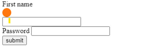
Let’s give Hover property to the class .red. here, first when we hover on the First Name then only this before property got activated.
<Style>
        .red:hover::before {
            content: '';
            display: block;
            width: 20px;
            height: 20px;
            border-radius: 10px;
            background-color: rgb(255, 115, 0);
        }
    </Style>
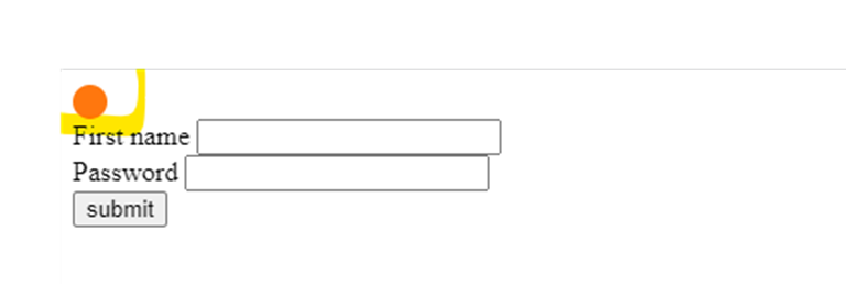
After pseudo selector
Here the circle will be displayed after the First name.
<Style>
        .red::after {
            content: '';
            display: block;
            width: 20px;
            height: 20px;
            border-radius: 10px;
            background-color: rgb(255, 115, 0);
        }
    </Style>
When we provide hover on this class, then it got displayed only when mouse hovers over there. It got applied to all the input where there is .red class. Here, it is displayed after the password also.
<Style>
        .red:hover::after {
            content: '';
            display: block;
            width: 20px;
            height: 20px;
            border-radius: 10px;
            background-color: rgb(255, 115, 0);
        }
    </Style>