Media Query
Published
•1 min read
Media Query
media query is an important property in CSS, this allows the developer to customize their webpages according to the screen size. According to the specified screen size, the written properties are matched and the information is displayed on the screen. eg.
<!DOCTYPE html>
<html lang="en">
<head>
    <meta charset="UTF-8">
    <meta http-equiv="X-UA-Compatible" content="IE=edge">
    <meta name="viewport" content="width=device-width, initial-scale=1.0">
    <title>Media Query</title>
</head>
<style>
    body {
        background-color: #207398;
        font-size: 22PX;
        padding: 2rem;

    }
    .CONTAINER{
        max-width: 1260PX;
        display: grid;
        /* grid-template-columns: 300px 300px 300px; */
        row-gap: 2px;
        gap: 15px;
    }
    .Book, .Paper{
        background-color: grey;
        border: 2px solid green;
        height: 95px;
        width: 150PX;
        text-align: center;


    }


<body>
<div class="CONTAINER">
        <div class="Book" id="Book-1">RED CHILLY-1</div>
        <div class="Book" id="Book-2">RED CHILLY-2</div>
        <div class="Book" id="Book-3">RED CHILLY-3</div>
        <div class="Book" id="Book-4">RED CHILLY-4</div>
        <div class="Book" id="Book-5">RED CHILLY-5</div>
        <div class="Book" id="Book-6">RED CHILLY-6</div>
        <div class="Paper" id="item"><a href="http://google.com" target="_blank" rel="noopener noreferrer">Google</a></div>
 </div>
</html>
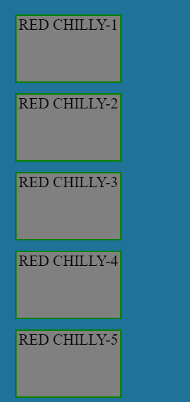
Output
when applying @media for different Screen sizes we can align the content accordingly.
@media (min-width:500px) and (max-width:900px) {
        .CONTAINER {
        max-width: 1260PX;
        display: grid;
        grid-template-columns: 300px 300px 300px;
        row-gap: 2px;
        gap: 15px;
            }
        }
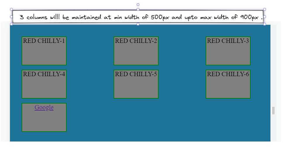
width less than 500px and width more than 900px, the previous container property will apply. Responsive web design for different screens can be built using media query.


