Table of contents
Flex Box:- An another property in Css which is applied on the container and it's items (it overcomes the limitation of block and inline display property).
Flexbox is single-dimensional. i.e the items in the container can be arranged in horizontal or vertical direction one at a time.
Flex properties that are applied on the parents:-
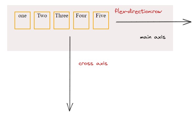
Flex direction:- row, row-reverse, column, column-reverse. According to the flex-direction main axis and cross axis is defined for the flex items.


Display: Flex and inline-flex. Both are applied on the parent container. Display inline does not make any difference to the flex items. it is the container which becomes inline, if we apply "display: inline-flex".
  .container{
        /* display: inline-flex/flex; */
        flex-direction: row;
        gap: 10px;
        text-align: center;
        height: 450px;
        width: 600px;
        border: 2px solid black;
        background-color: #f3ecec;
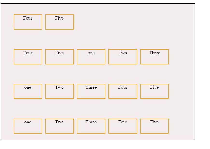
Flex Wrap :- nowrap | wrap | wrap-reverse; By default flex is having nowrap feature .

wrap-reverse example:-

Flex Flow:- This is the combined property of Flex-direction and Flex-wrap.
Justify-content:- works along main-axis for the items. it has flex-start, flex-end, center, space-around, space-between, space-evenly. justify-content: space-between;
aligns-items:- works along the cross-axis for the items. properties are:- flex-start, flex-end, center, stretch, baseline.
Align-content:- flex-start, flex-end, center, stretch, space-between, space-around. applicable on multi-line flex items. Items present in single line will not reflect. wrap or wrap-reverese property should be given to demonstrate align-content property.
Gap :- to provide gap between the flex-items.
Row-gap:- gap between rows.
Column-gap:-gap between column.
Properties applied on the children:-
- Order :- by default the order is Zero for every item present in the container. we can assign order values +ve or - ve values and the position changes as per the preferences assigned. highest order will be placed last and least order will be present first.
- Flex-grow:- The assigned item's size will increase proportionately to the provided ratio.
- Flex-shrink:- The assigned item's size will decrease proportionately to the provided ratio.
- Align-self:- auto | flex-start | flex-end | center | baseline | stretch; it is applicable on the individual item.
<!DOCTYPE html>
<html lang="en">
<head>
    <meta charset="UTF-8">
    <meta http-equiv="X-UA-Compatible" content="IE=edge">
    <meta name="viewport" content="width=device-width, initial-scale=1.0">
    <title>Flex box</title>
<style>
    .container{
        display: flex;
        flex-direction: row;
        gap: 10px;
        text-align: center;
        height: 450px;
        width: 600px;
        border: 2px solid black;
        background-color: #f3ecec;
        flex-wrap: wrap-reverse;
        /* flex-flow: column-wrap-reverse; */
        /* align-content: space-around; */
        /* justify-content: space-between; */
        /* align-items: stretch; */

    }
.item {
    height: 50px;
    width: 95px;
    border: 2px solid orange;
    list-style: none;
    box-sizing: border-box;
    margin-top: 20px;
    margin-bottom: 20px;

    }

</style>

</head>
<body>
    <div>
        <ul class="container">
            <li class="item one">one</li>
            <li class="item Two">Two</li>
            <li class="item Three">Three</li>
            <li class="item Four">Four</li>
            <li class="item Five">Five</li> <li class="item one">one</li>
            <li class="item Two">Two</li>
            <li class="item Three">Three</li>
            <li class="item Four">Four</li>
            <li class="item Five">Five</li> <li class="item Four">Four</li>
            <li class="item Five">Five</li> <li class="item one">one</li>
            <li class="item Two">Two</li>
            <li class="item Three">Three</li>
            <li class="item Four">Four</li>
            <li class="item Five">Five</li>
        </ul>
</body>
</html>

