Css Grid

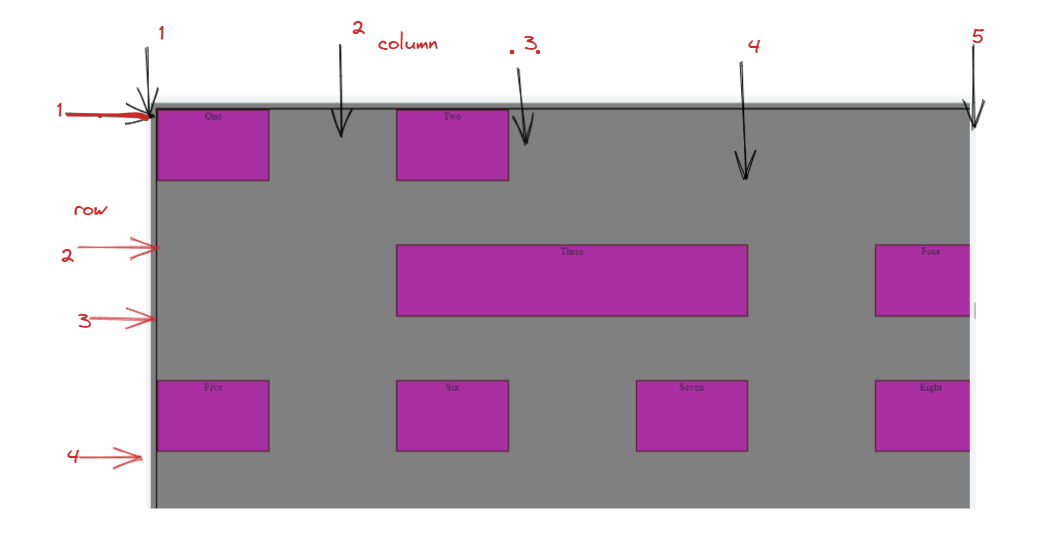
Grid follows the two-dimensional property whereas flex is one dimensional in nature. i.e it's element are arranged both in row and column. when we apply display: Grid, the direct child items automatically becomes grid item.
we need to specify row and column along with display grid property.
eg. display: grid;
grid-template-columns: repeat(4, 1fr);
grid-template-rows: repeat(3, 1fr);
here, 1 fr is 1 fraction of entire Width., column is 4 and row is 3
this is repeat function, we can write like:-
grid-template-columns: 120px 200px 300px 100px; any random value
or
grid-template-columns: repeat(4, 120px);
.container {
        text-align: center;
        height: 100vh;
        width: 100vw;
        border: 2px solid black;
        display: grid;
        justify-content: center;
        flex-wrap: nowrap;
        gap: 10px;
        align-items: left;
        grid-template-columns: repeat(4, 1fr);
        grid-template-rows: repeat(3, 1fr);
        column-gap: 200px;
        row-gap: 100px;
output:-
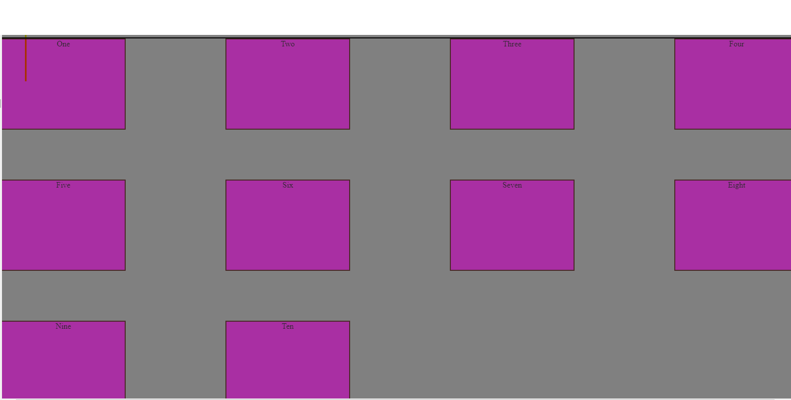
row gap/column gap:- it set's a defined gap between rows and columns. here, it is column gap:-200px and row is 100px.
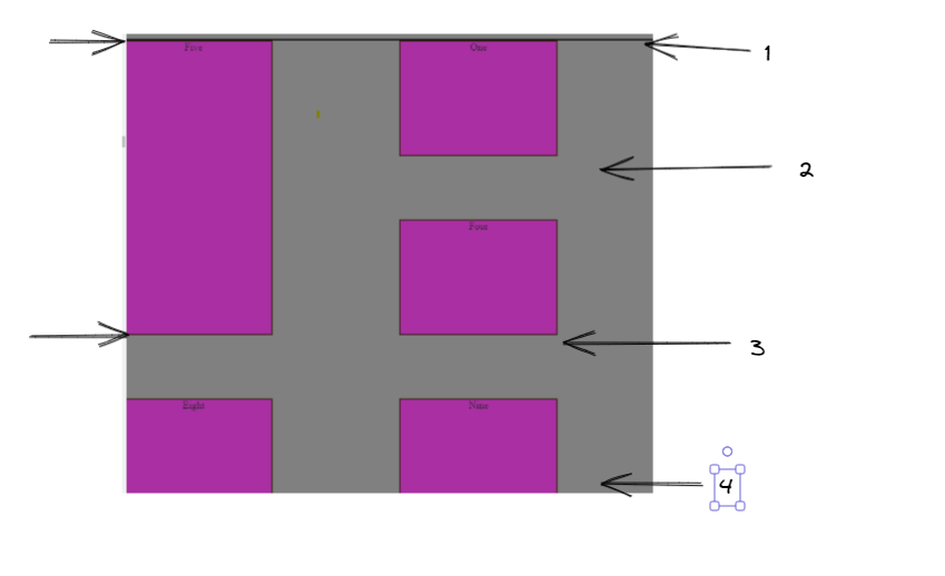
grid-column-start grid-column-end grid-row-start grid-row-end**
all the above are applied on grid items which defines there starting and end point.
.Three {
        grid-column-start: 2;
        grid-column-end: 4;
here item 3 starts at column 2 and ends at column 4.
.Five {
        grid-row-start: 1;
        grid-row-end: 3;
      }
here item 5 starts at row 1 and ends at column 3. so by this way, we can specify the starting and end point of grid cells according to column and row.
<!DOCTYPE html>
<html lang="en">
  <head>
    <meta charset="UTF-8" />
    <meta http-equiv="X-UA-Compatible" content="IE=edge" />
    <meta name="viewport" content="width=device-width, initial-scale=1.0" />
    <title>GRID</title>
    <style>
      * {
        background-color: grey;
      }
      .container {
        text-align: center;
        height: 100vh;
        width: 100vw;
        border: 2px solid black;
        display: grid;
        justify-content: center;
        flex-wrap: nowrap;
        gap: 10px;
        align-items: left;
        grid-template-columns: repeat(4, 1fr);
        grid-template-rows: repeat(3, 1fr);
        column-gap: 200px;
        row-gap: 100px;
      }
      .items {
        /* height: 50px;
        width: 75px; */
        border: 2px solid #330202;
        text-align: center;
        background-color: #bb0cb2;
        opacity: 70%;


        /* margin-right: auto;
            margin-left: auto;
            margin-top: 10px;
            display: block; */
      }
      .Five {
        grid-row-start: 1;
        grid-row-end: 3;
      }

      .Three {
        /* grid-column-start: 2;
        grid-column-end: 4; */
    </style>
  </head>
  <body>
    <div class="container">
      <div class="items">One</div>
      <div class="items">Two</div>
      <div class="items Three">Three</div>
      <div class="items">Four</div>
      <div class="items Five" >Five</div>
      <div class="items">Six</div>
      <div class="items">Seven</div>
      <div class="items">Eight</div>
      <div class="items">Nine</div>
      <div class="items">Ten</div>
    </div>
  </body>
</html>


